This tutorial gives an introduction t the various 2D plots in Euler.
Euler can plot 2D plots of
Plot styles include various styles for lines and points, bar plots and shaded plots.
The most important plotting function for planar plots is plot2d(). The function is implemented in the Euler language in the file "plot.e", which is loaded at the start of the program.
plot2d() accepts expressions, functions and data.
The plot range is set with the following assigned parameters
Here is the most basic example, which uses the default range and sets an automatic y-range to fit the plot of the function.
Note: If you end a command line with a colon ":", the plot will be inserted into the text window. Otherwise, press TAB to see the plot if the plot window is covered.
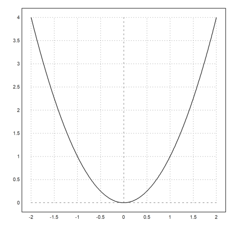
>plot2d("x^2"):
An alternative to the colon is the command insimg(lines), which inserts the plot occupying a specified number of text lines.
In the options, the plots can be set to appear
In any case, press the tabulator key to see the plot, if it is hidden.
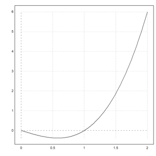
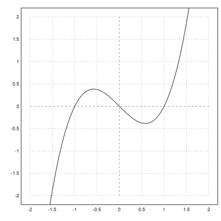
>plot2d("x^3-x",0,2); insimg(20);
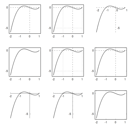
In plot2d(), there are alternative styles available with grid=x. For an overview, we show the various grid styles in one figure (see below for the figure() command). The style grid=0 is not included. It shows no grid and no frame.
More styles can be achieved with specific plot commands. In the following, we use grid=1 to grid=9.
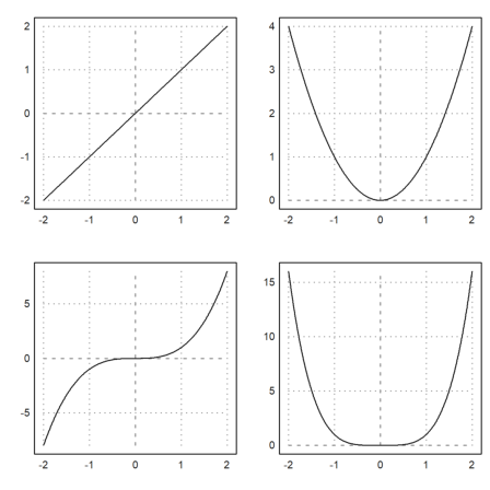
>figure(3,3); ...
 for k=1:9; figure(k); plot2d("x^3-x",-2,1,grid=k); end; ...
 figure(0):
If the the arguments to plot2d() are an expression followed by four numbers, these numbers are the x- and y-ranges for the plot.
Alternatively, a, b, c, d can be specified as assigned parameters as a=... etc.
In the following example, we change the grid style, add labels, and use vertical labels for the y-axis.
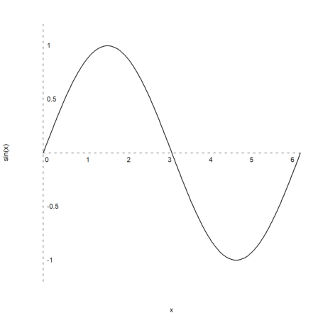
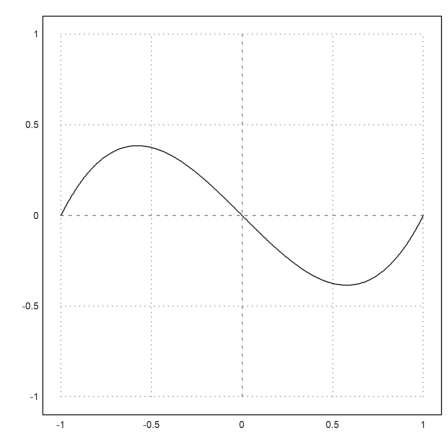
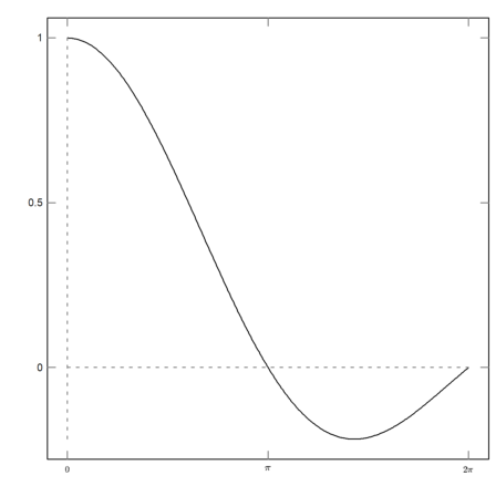
>plot2d("sin(x)",0,2pi,-1.2,1.2,grid=3,xl="x",yl="sin(x)"):
Plots are quadratic by default. You can change this default in the menu with "Set Aspect" to a specific aspect ratio or to the current size of the graphics window.
But you can change it also for one plot. For this, the current size of the plot area is changed, and the window is set so that the labels have enough space.
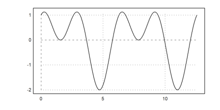
>aspect(2); plot2d("sin(x)+cos(2*x)",0,4pi):
The images generated by inserting the plot into the text window are stored in the same directory as the notebook, by default in a subdirectory named "images". They are also included into the HTML export.
You can simply mark any image and copy it to the clipboard with Ctrl-C and insert it into a word document or into an image editor. You can also export the current graphics with the functions in the File menu.
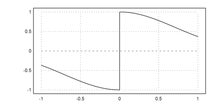
The function or the expression in plot2d() is evaluated adaptively. For more speed, switch off adaptive plots with <adaptive and specify the number of sub-intervals with n=... This should be necessary in rare cases only.
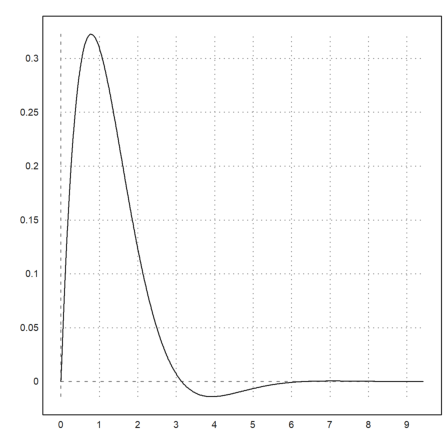
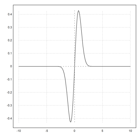
>plot2d("sign(x)*exp(-x^2)",-1,1,<adaptive,n=10000):
We reset the aspect ratio with the aspect() function.
>aspect();  ...
 plot2d("x^x",r=1.2,cx=1,cy=1):
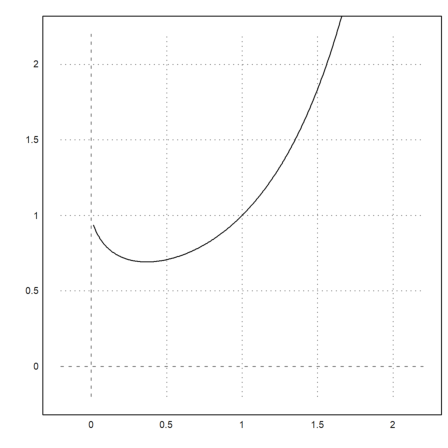
Note that x^x is not defined for x<=0. The plot2d function catches this error, and starts plotting as soon as the function is defined. This works for all functions which return NAN off their range of definition.
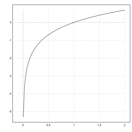
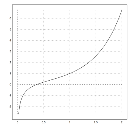
>plot2d("log(x)",-0.1,2):
The parameter >square selects the y-range automatically so that the result is a square plot window. Note that by default, Euler uses a square space inside the plot window.
>plot2d("x^3-x",>square):
To split the window into several plots, use the figure() command. In the example, we plot x^1 to x^4 into 4 parts of the window. figure(0) resets the default window.
>figure(2,2); ...
 for n=1 to 4; figure(n); plot2d("x^"+n); end; ...
 figure(0):
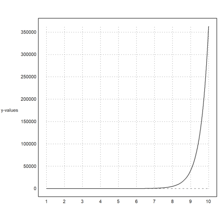
If you need more space for the y-labels, call shrinkwindow() with the >smaller parameter, or set a positive value for "smaller" in plot2d().
>plot2d("gamma(x)",1,10,yl="y-values",smaller=6,<vertical):
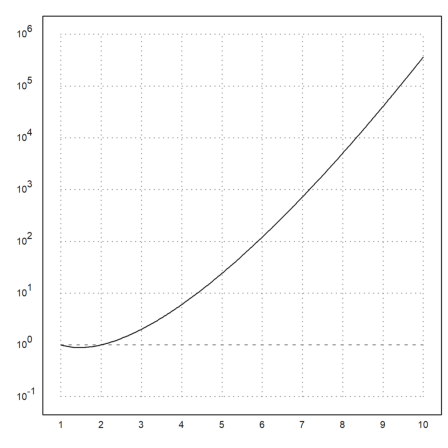
A logarithmic plot is possible with
>plot2d("gamma(x)",1,10,logplot=1):
The function plot2d() also accepts the names of numerical or symbolic functions.
>function f(x) := x^3-x; ...
 plot2d("f",r=1):
Here is a summary of the accepted functions
For symbolic functions, the name alone works.
>function f(x) &= diff(x^x,x)
                            x
                           x  (log(x) + 1)
>plot2d(f,0,2):
Of course, for expressions or symbolic expressions the name of the variable is enough to plot them.
>expr &= sin(x)*exp(-x)
                              - x
                             E    sin(x)
>plot2d(expr,0,3pi):
For the line style there are various options.
Colors can be selected as one of the default colors, or as an RGB color.
>plot2d("exp(-x^2)",r=2,color=red,thickness=3,style="--"):
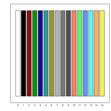
Here is a view of the predefined colors of EMT.
>columnsplot(ones(1,16),lab=0:15,grid=0,color=0:15):
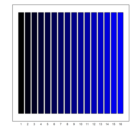
But you can use any color.
>columnsplot(ones(1,16),grid=0,color=rgb(0,0,linspace(0,1,15))):
To plot more than one function into one window, call plot2d one more time, and use >add.
>plot2d("cos(x)",r=2,grid=6); plot2d("x",style=".",>add):
Alternatively, a vector of strings can be used. You can then use a color array, an array of styles, and an array of thicknesses of the same length.
>plot2d(["sin(x)","cos(x)"],0,2pi,color=4:5):
Another alternative is to use the matrix language of Euler.
If an expression produces a matrix of functions, with one function in each row, all these functions will be plotted into one plot.
For this, use a parameter vector in form of a column vector. If a color array is added it will be used for each row of the plot.
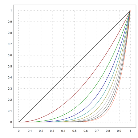
>n=(1:10)'; plot2d("x^n",0,1,color=1:10):
Expressions and one-line functions can see global variables.
If you cannot use a global variable, you need to use a function with an extra parameter, and pass this parameter as a semicolon parameter.
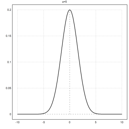
Take care, to put all assigned parameters to the end of the plot2d command. In the example we pass a=5 to the function f, which we plot from -10 to 10.
>function f(x,a) := 1/a*exp(-x^2/a); ...
 plot2d("f",-10,10;5,thickness=2,title="a=5"):
Alternatively, use a collection with the function name and all extra parameters. These special lists are called "call collections", and that is the preferred way to pass arguments to a function which is itself passed as an argument to another function.
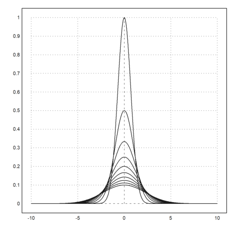
In the following example, we use a loop to plot several functions (see the tutorial about programming for loops).
>plot2d({{"f",1}},-10,10); ...
 for a=2:10; plot2d({{"f",a}},>add); end:
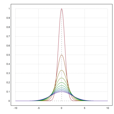
We could achieve the same result in the following way using the matrix language of EMT. Each row of the matrix f(x,a) is one function. Moreover, we can set colors for each row of the matrix. Double click on the function getspectral() for an explanation.
>x=-10:0.01:10; a=(1:10)'; plot2d(x,f(x,a),color=getspectral(a/10)):
Simple decorations can be
The label command will plot into the current plot at the plot coordinates (x,y). It can take a positional argument.
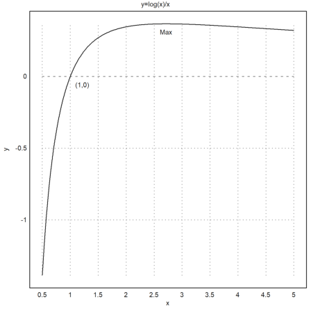
>expr := "log(x)/x"; ...
   plot2d(expr,0.5,5,title="y="+expr,xl="x",yl="y"); ...
   label("(1,0)",1,0); label("Max",E,expr(E),pos="lc"):
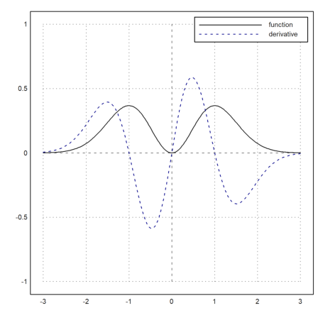
There is also the function labelbox(), which can show the functions and a text. It takes vectors of strings and colors, one item for each function.
>function f(x) &= x^2*exp(-x^2);  ...
 plot2d(&f(x),a=-3,b=3,c=-1,d=1);  ...
 plot2d(&diff(f(x),x),>add,color=blue,style="--"); ...
 labelbox(["function","derivative"],styles=["-","--"], ...
    colors=[black,blue],w=0.4):
The box is anchored at the top right by default, but >left anchors it at the top left. You can move it to any place you like. The anchor position is the top right corner of the box, and the numbers are fractions of the size of the graphics window. The width is automatic.
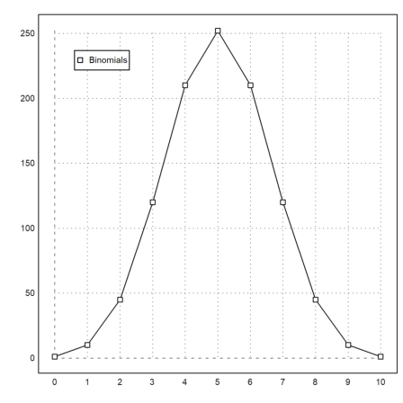
For point plots, the label box works too. Add a parameter >points, or a vector of flags, one for each label.
In the following example, there is only one function. So we can use strings instead of vectors of strings. We set the text color to black for this example.
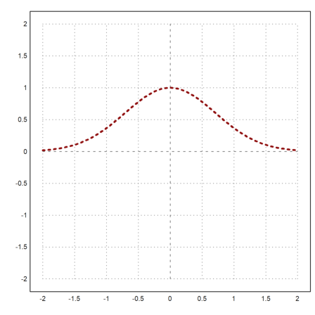
>n=10; plot2d(0:n,bin(n,0:n),>addpoints); ...
 labelbox("Binomials",styles="[]",>points,x=0.1,y=0.1, ...
 tcolor=black,>left):
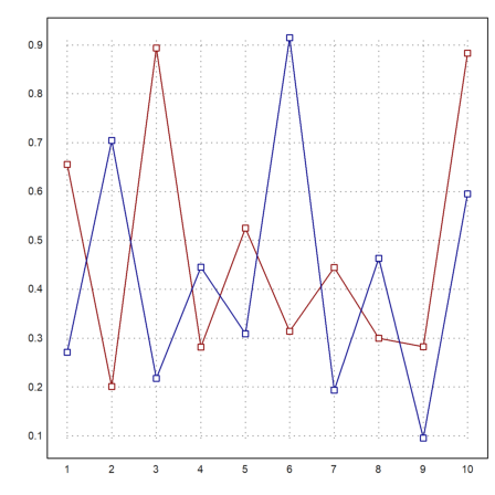
This style of plot is also available in statplot(). Like in plot2d() colors can be set for each row of the plot. There are more special plots for statistical purposes (see the tutorial about statistics).
>statplot(1:10,random(2,10),color=[red,blue]):
A similar feature is the function textbox().
The width is by default the maximal widths of the text lines. But it can be set by the user too.
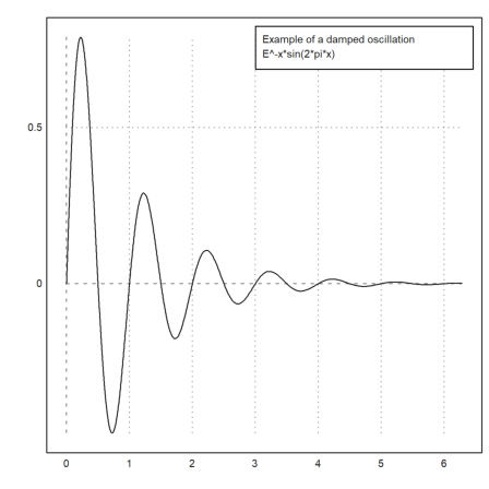
>function f(x) &= exp(-x)*sin(2*pi*x); ...
 plot2d("f(x)",0,2pi); ...
 textbox(["Example of a damped oscillation",&f(x)],w=0.5):
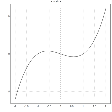
Text labels, titles, label boxes and other text can contain Unicode strings (see the syntax of EMT for more about Unicode strings).
>plot2d("x^3-x",title=u"x → x³ - x"):
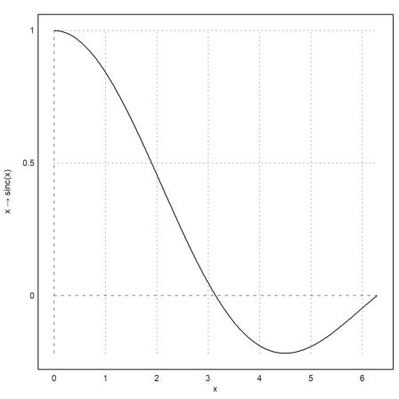
The labels on the x- and y-axis can be vertical, as well as the axis.
>plot2d("sinc(x)",0,2pi,xl="x",yl=u"x → sinc(x)",>vertical):
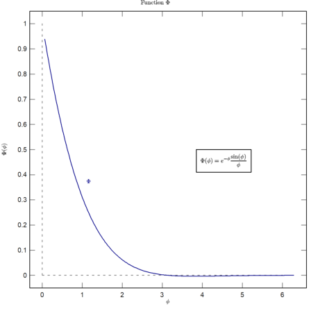
You can also plot LaTeX formulas if you have installed the LaTeX system. I recommend MiKTeX. The path to the binaries "latex" and "dvipng" should be in the system path, or you have to setup LaTeX in the options menu.
Note, that parsing LaTeX is slow. If you want to use LaTeX in animated plots, you should call latex() before the loop once and use the result (an image in an RGB matrix).
In the following plot, we use LaTeX for x- and y-labels, a label, a label box and the title of the plot.
>plot2d("exp(-x)*sin(x)/x",a=0,b=2pi,c=0,d=1,grid=6,color=blue, ...
   title=latex("\text{Function $\Phi$}"), ...
   xl=latex("\phi"),yl=latex("\Phi(\phi)")); ...
 textbox( ...
   latex("\Phi(\phi) = e^{-\phi} \frac{\sin(\phi)}{\phi}"),x=0.8,y=0.5); ...
 label(latex("\Phi",color=blue),1,0.4):
Often, we wish a non-conformal spacing and text labels on the x-axis. We can use xaxis() and yaxis() as we will show later.
The easiest way is to do a blank plot with a frame using grid=4, and then to add the grids with ygrid() and xgrid(). In the following example, we use three LaTeX strings for the labels on the x-axis with xtick().
>plot2d("sinc(x)",0,2pi,grid=4,<ticks); ...
 ygrid(-2:0.5:2,grid=6); ...
 xgrid([0:2]*pi,<ticks,grid=6);  ...
 xtick([0,pi,2pi],["0","\pi","2\pi"],>latex):
I the demos, we already showed the >user flag, which works for plot2d() and plot3d(). The user can
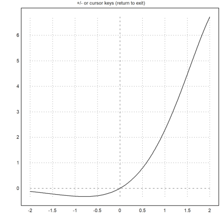
>plot2d("exp(x)*sin(x)",user=true, ...
   title="+/- or cursor keys (return to exit)"):
The following demonstrates an advanced way of user interaction (see the tutorial about programming for details).
The built-in function mousedrag() waits for mouse or keyboard events. It reports mouse down, mouse moved or mouse up, and key presses. The function dragpoints() makes use of this, and lets the user drag any point in a plot.
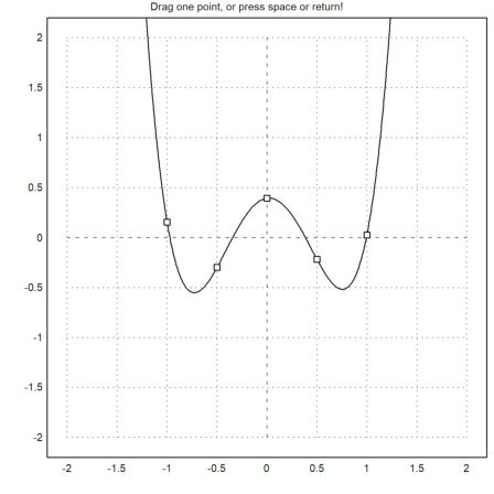
We need a plot function first. For an example, we interpolate in 5 points with a polynomial. The function should plot into a fixed plot area.
>function plotf(xp,yp,select) ...
   d=interp(xp,yp);
   plot2d("interpval(xp,d,x)";d,xp,r=2);
   plot2d(xp,yp,>points,>add);
   if select>0 then
     plot2d(xp[select],yp[select],color=red,>points,>add);
   endif;
   title("Drag one point, or press space or return!");
 endfunction
Note the semicolon parameters in plot2d (d and xp), which are passed to the evaluation of the interp() function. Without this, we must write a function plotinterp() first, accessing the values globally.
Now we generate some random values, and let the user drag the points.
>t=-1:0.5:1; dragpoints("plotf",t,random(size(t))-0.5):
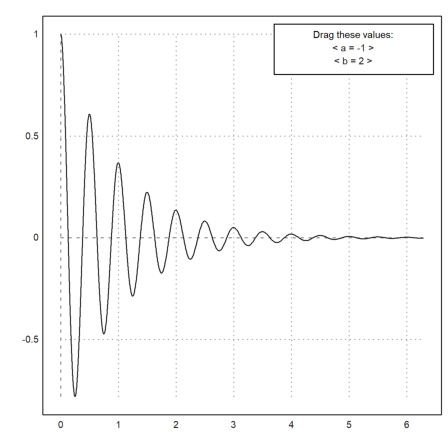
There is also a function, which plots another function depending on a vector of parameters, and lets the user adjust these parameters.
First we need the plot function.
>function plotf([a,b]) := plot2d("exp(a*x)*cos(2pi*b*x)",0,2pi;a,b);
Then we need names for the parameters, initial values and a nx2 matrix of ranges, optionally a heading line.
>dragvalues("plotf",["a","b"],[-1,2],[[-2,2];[1,10]], ...
   heading="Drag these values:",hcolor=black):
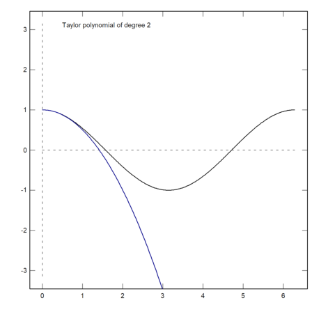
It is possible to restrict the dragged values to integers. For an example, we write a plot function, which plots a Taylor polynomial of degree n to the cosine function.
>function plotf(n) ...
 plot2d("cos(x)",0,2pi,>square,grid=6);
 plot2d(&"taylor(cos(x),x,0,@n)",color=blue,>add);
 textbox("Taylor polynomial of degree "+n,0.1,0.02,style="t",>left);
 endfunction
Now we allow the degree n to vary from 0 to 20 in 20 stops. The result of dragvalues() is used to plot the sketch with this n, and to insert the plot into the notebook.
>nd=dragvalues("plotf","degree",2,[0,20],20,y=0.8, ...
    heading="Drag the value:"); ...
 plotf(nd):
If you want to use mousedrag() for your own function, you need to refer to the reference for details.
The following is a simple demonstration of the function. The user can draw over the plot window, leaving a trace of points.
>function dragtest ...
   plot2d(none,r=1,title="Drag with the mouse, or press any key!");
   start=0;
   repeat
     {flag,m,time}=mousedrag();
     if flag==0 then return; endif;
     if flag==2 then
       hold on; mark(m[1],m[2]); hold off;
     endif;
   end
 endfunction
>dragtest
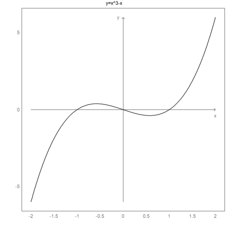
The default style of the axis and the labels can be modified. Additionally, labels and a title can be added manually. To reset to the default styles, use reset().
>gridstyle("->",color=gray,textcolor=gray,framecolor=gray);  ...
  plot2d("x^3-x",grid=1);   ...
  settitle("y=x^3-x",color=black); ...
  label("x",2,0,pos="bc",color=gray);  ...
  label("y",0,6,pos="cl",color=gray); ...
  reset():
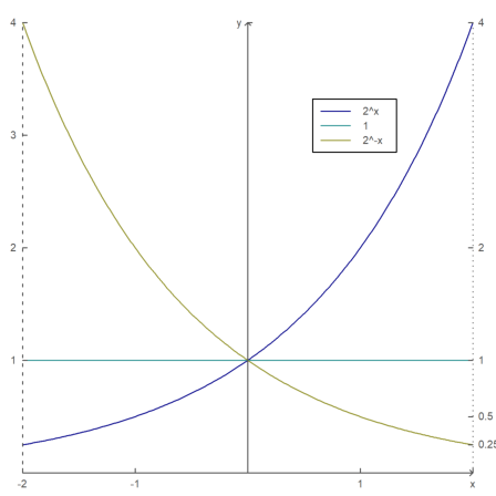
For even more control, the x-axis and the y-axis can be done manually.
The command fullwindow() expands the plot window since we no longer need place for labels outside the plot window. Use shrinkwindow() or reset() to reset to the defaults.
>fullwindow; ...
  gridstyle(color=darkgray,textcolor=darkgray); ...
  plot2d(["2^x","1","2^(-x)"],a=-2,b=2,c=0,d=4,<grid,color=4:6,<frame); ...
  xaxis(0,-2:1,style="->"); xaxis(0,2,"x",<axis); ...
  yaxis(0,4,"y",style="->"); ...
  yaxis(-2,1:4,>left); ...
  yaxis(2,2^(-2:2),style=".",<left); ...
  labelbox(["2^x","1","2^-x"],colors=4:6,x=0.8,y=0.2); ...
  reset:
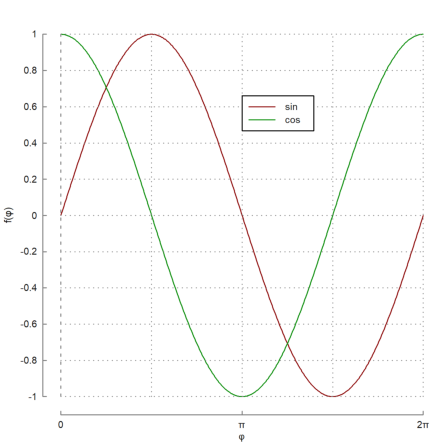
Here is another example, where Unicode strings are used and axes outside the plot area.
>plot2d(["sin(x)","cos(x)"],0,2pi,color=[red,green],<grid,<frame); ... xaxis(-1.1,(0:2)*pi,xt=["0",u"π",u"2π"],style="-",>ticks,>zero); ... xgrid((0:0.5:2)*pi,<ticks); ... yaxis(-0.1*pi,-1:0.2:1,style="-",>zero,>grid); ... labelbox(["sin","cos"],colors=[red,green],x=0.5,y=0.2,>left); ... xlabel(u"φ"); ylabel(u"f(φ)"):
Plotting an expression is only an abbreviation for data plots. From the range and the x-values the plot2d function will compute the data to plot, by default with adaptive evaluation of the function.
But you can enter data directly.
Here is an example with one row for x and y.
>x=-10:0.1:10; y=exp(-x^2)*x; plot2d(x,y):
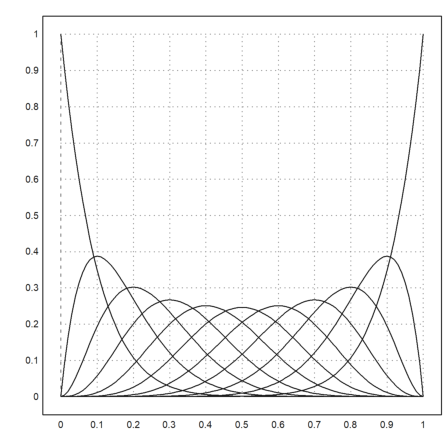
In the following example, we generate the Bernstein-Polynomials.
![]()
We generate a matrix of values with one Bernstein-Polynomial in each row. For this, we simply use a column vector of i. Have a look into the introduction about the matrix language to learn more details.
>x=0:0.01:1; n=10; i=(0:n)'; y=bin(n,i)*x^i*(1-x)^(n-i); ...
 plot2d(x,y):
Note that the color parameter can be a vector. Then each color is used for each row of the matrix.
>x=linspace(0,1,200); y=x^(1:10)'; plot2d(x,y,color=1:10):

The x-values need not be sorted. (x,y) simply describes a curve. If x is sorted, the curve is a graph of a function.
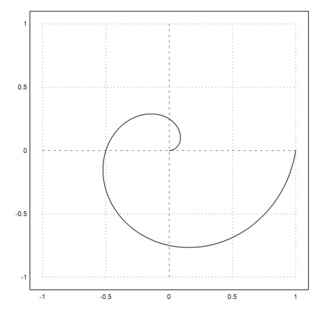
In the following example, we plot the spiral
![]()
We either need to use very many points for a smooth look or the function adaptive() to evaluate the expressions (see the function adaptive() for more details).
>t=linspace(0,1,1000); ...
 plot2d(t*cos(2*pi*t),t*sin(2*pi*t),r=1):
Alternatively, it is possible to use two expressions for curves. The following plots the same curve as above.
>plot2d("x*cos(2*pi*x)","x*sin(2*pi*x)",xmin=0,xmax=1,r=1);
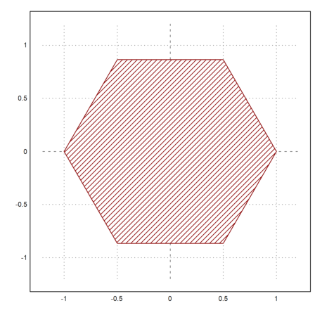
Data plots are really polygons.
In the following example we plot a hexagon using a closed curve with 7 points.
>t=linspace(0,2pi,6); ...
 plot2d(cos(t),sin(t),>filled,style="/",fillcolor=red,r=1.2):
Data can also be plotted as points. Use points=true for this. The plot works like polygons, but draws only the corners.
>n=10; i=0:n; ...
 plot2d(i,bin(n,i)/2^n,a=0,b=10,c=0,d=0.3); ...
 plot2d(i,bin(n,i)/2^n,points=true,style="ow",add=true,color=blue):
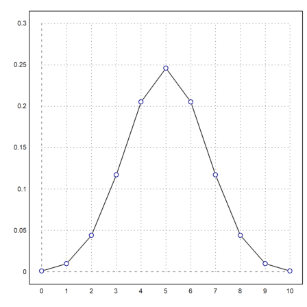
Moreover, data can be plotted as bars. In this case, x should be sorted and one element longer than y. The bars will extend from x[i] to x[i+1] with values y[i]. If x has the same size as y, it will be extended by one element with the last spacing.
Fill styles can be used just as above.
>n=10; k=bin(n,0:n); ...
 plot2d(-0.5:n+0.5,k,bar=true,fillcolor=lightgray):
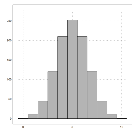
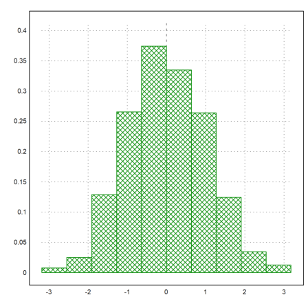
For distributions, there is the parameter distribution=n, which counts values automatically and prints the relative distribution with n sub-intervals.
>plot2d(normal(1,1000),distribution=10,style="\/"):
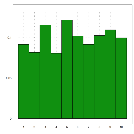
With the parameter even=true, this will use integer intervals.
>plot2d(intrandom(1,1000,10),distribution=10,even=true):
Note that there are many statistical plots, which might be useful. Have a look at the tutorial about statistics.
>columnsplot(getmultiplicities(1:6,intrandom(1,6000,6))):
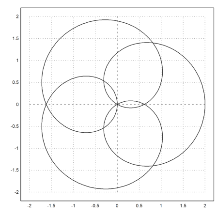
A vector of complex numbers is automatically plotted as a curve in the complex plane with real part and imaginary part.
In the example, we plot the unit circle with
![]()
>t=linspace(0,2pi,1000); ...
 plot2d(exp(I*t)+exp(4*I*t),r=2):
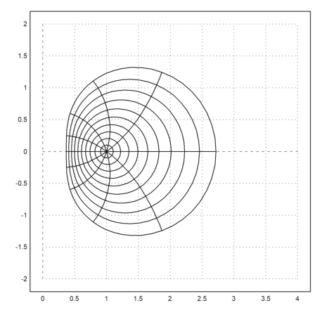
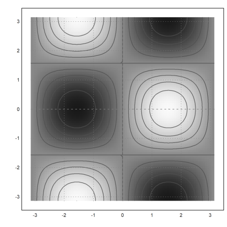
A matrix of complex numbers will automatically plot as a grid in the complex plane.
In the example, we plot the image of the unit circle under the exponential function. The cgrid parameter hides some of the grid curves.
>r=linspace(0,1,20); t=linspace(0,2pi,80)'; z=exp(r*exp(I*t));  ...
 plot2d(z,a=0,b=4,c=-2,d=2,cgrid=10):
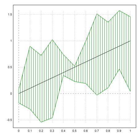
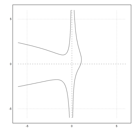
A vector of intervals is plotted against x values as a filled region between lower and upper values of the intervals.
This is can be useful to plot errors of the computation. But it can also be used to plot statistical errors.
>t=0:0.1:1; ...
 plot2d(t,interval(t-random(size(t)),t+random(size(t))),style="|");  ...
   plot2d(t,t,add=true):
Implicit plots of sets f(x,y)=c are explained in
Here is an example with automatic levels.
>plot2d("sin(x)*cos(y)",r=pi,>hue,>levels,n=100):
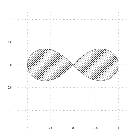
It is possible to specify a specific level. E.g., we can plot the solution of an equation like
![]()
>plot2d("x^3-x*y+x^2*y^2",r=6,level=1,n=100):
We can also fill ranges of values like
![]()
>plot2d("(x^2+y^2)^2-x^2+y^2",r=1.2,level=[-1;0],style="/"):
plot2d() and plot3d() are built on more basic plot routines. You might need these basic routines for speedy animations. Note, however, that Euler uses a buffer to store all its graphics, which cannot be disabled, since it is used for insimg() and for graphics export.
More information on the basic plot routines are contained in the core documentation of Euler, and in some Euler files.
../reference/eulercore
../reference/plothelp
../reference/framed
../reference/plot
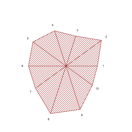
If you decide to write your own plotting stuff you can use the following function for a start. It plots a star like shape with equal spaced angles given a vector of radii. Optionally, the user can change the color and the fill style, and it is possible to add labels. Note, that there is already a function starplot() in Euler.
We do not assume that hold is off, since the function might be used in a split window. Then clg would delete the rest of the plots. Moreover, we carefully restore all styles and colors.
>function starplot1 (v, style="/", color=green, lab=none) ...
   if !holding() then clg; endif;
   w=window(); window(0,0,1024,1024);
   h=holding(1);
   r=max(abs(v))*1.2;
   setplot(-r,r,-r,r);
   n=cols(v); t=linspace(0,2pi,n);
   v=v|v[1]; c=v*cos(t); s=v*sin(t);
   cl=barcolor(color); st=barstyle(style);
   loop 1 to n
     polygon([0,c[#],c[#+1]],[0,s[#],s[#+1]],1);
     if lab!=none then
       rlab=v[#]+r*0.1;
       {col,row}=toscreen(cos(t[#])*rlab,sin(t[#])*rlab);
       ctext(""+lab[#],col,row-textheight()/2);
     endif;
   end;
   barcolor(cl); barstyle(st);
   holding(h);
   window(w);
 endfunction
There is no grid or axis ticks here. Moreover, we use the full window for the plot.
We call reset before we test this plot to restore the graphics defaults. This is not necessary, if you are sure that your plot works.
>reset; starplot1(normal(1,10)+5,color=red,lab=1:10):
Sometimes, you may want to plot something that plot2d cannot do, but almost.
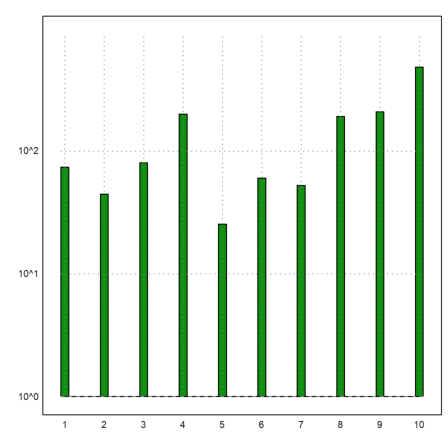
In the following function, we do a logarithmic impulse plot. plot2d can do logarithmic plots, but not for impulse bars.
>function logimpulseplot1 (x,y) ...
   {x0,y0}=makeimpulse(x,log(y)/log(10));
   plot2d(x0,y0,>bar,grid=0);
   h=holding(1);
   frame();
   xgrid(ticks(x));
   p=plot();
   for i=-10 to 10;
     if i<=p[4] and i>=p[3] then
        ygrid(i,yt="10^"+i);
     endif;
   end;
   holding(h);
 endfunction
Let us test it with exponentially distributed values.
>x=1:10; y=-log(random(size(x)))*200; ...
 logimpulseplot1(x,y):
Let us animate a 2D curve using direct plots. The plot(x,y) command simply plots a curve into the plot window. setplot(a,b,c,d) sets this window.
The wait(0) function forces the plot to appear on the graphics windows. Otherwise, the redraw takes place in sparse time intervals.
>function animliss (n,m) ...
 t=linspace(0,2pi,500);
 f=0;
 c=framecolor(0);
 l=linewidth(2);
 setplot(-1,1,-1,1);
 repeat
   clg;
   plot(sin(n*t),cos(m*t+f));
   wait(0);
   if testkey() then break; endif;
   f=f+0.02;
 end;
 framecolor(c);
 linewidth(l);
 endfunction
Press any key to stop this animation.
>animliss(2,3);